Patreon Case Study

Intro

As part of the Memorisely 2024's UX/UI Design cohort, our second case-study to solve was to enhance the content creator discoverability within Patreon's desktop app.

Timeline : 5 weeks

Business Goal

The business goal was defined as : "The primary goal is to enhance the discoverability of creatives on Patreon, thereby increasing patron engagement and support for a wider range of creators. This improvement should lead to increased patronage, higher creator satisfaction, and overall growth in the platform's user base and revenue."
Final Version

Design Brief

User Segment

The focus is on new and existing patrons who are interested in exploring and supporting creatives across various genres but may not have specific creators in mind.

Task

Research, ideate and redesign the Patreon "Find creators" experience to make it more engaging, personalized, and effective in connecting patrons with creatives that match their interests.

Problem Statement

By understanding the business need we defined our problem statement as : Currently, content creators on Patreon especially emerging and niches, struggle with discoverability on the platform. This challenge hinders their ability to grow their patron base and achieve financial stability. On the other hand, patrons often find it difficult to discover new and diverse creators that align with their interests, which can lead to decreased engagement and support.

Solution

Based on understanding the business goal as well as the problem statement, the following highlighted takeways guided us in the execution and completion of the design:

  • Generative User Interviews

    1. Conduct interviews with individuals who are not current users of Patreon. The aim is to understand their content preferences, discoverability expectations, and perceived barriers to supporting creators on such platforms. This generative research will inform the development of a user-centric discovery experience.
  • Ideation

    1. Leverage insights from these interviews to brainstorm innovative features that could improve the discovery process on Patreon.
  • Prototype Development

    1. Create wireframes and prototypes for the new discovery interface, incorporating the ideas generated from the research and ideation phase.
  • Usability Testing

    1. Test the prototype with a group of potential users to gather feedback and refine the design accordingly.
  • Handover documentation

    1. Following testing, ensure your Figma file is prepped for a smooth handover to engineer.

Discovery

Synthesis and Affinity Mapping

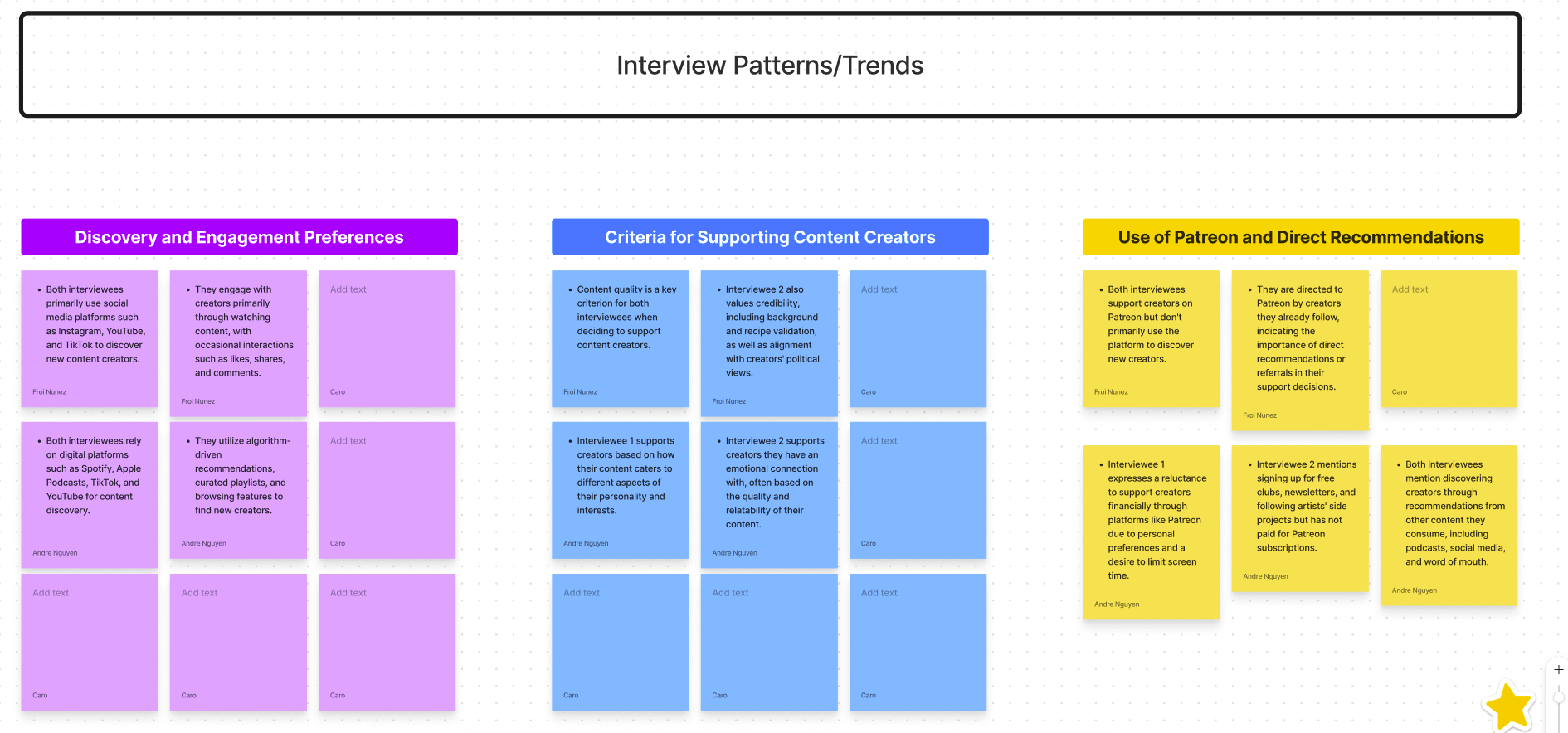
As outlined previously, our first step was to conduct User Interviews. After conducting 6 interviews, we synthesized the data and categorized them within 3 trends/patterns in order to guide our design:

Key learnings from our data synthesis where the following :

  • Quality:Interviewees prioritize content quality and credibility when choosing to support creators. Furthermore, direct recommendations or referrals from creators influence their support decisions on platforms like Patreon.
  • Social media variety: Other social media platforms like Instagram, YouTube, and TikTok play significant roles in content discovery.
  • Diverse Content Consumption: Interviewees engage with a variety of content types, indicating the importance of catering to different interests and preferences.
  • Passive vs. Active Support: While one interviewee prefers passive consumption without direct engagement, others actively supports creators through streaming, attending live events, and purchasing merchandise.
  • Discovery Challenges: Despite the effectiveness of algorithms and curated playlists, both interviewees express challenges in discovering new creators, indicating a potential gap in content discovery methods or platforms.

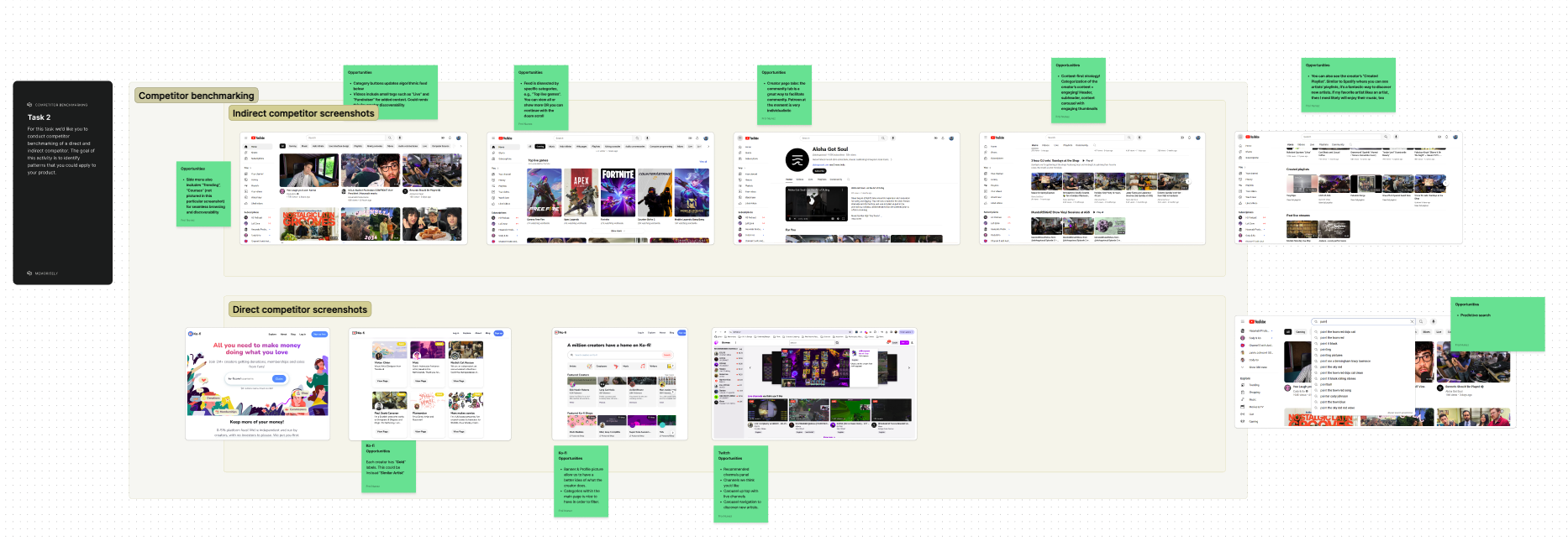
Competitor Benchmarking

As we know, competitor benchmarking is a critical process for any business aiming to gain a competitive edge in its market. For an app focused on enhancing the discoverability of content creators, understanding both direct and indirect competitors provides valuable insights that inform strategic decisions, drive innovation, and ensure the app meets and exceeds user expectations.

Areas of opportunities we discovered and decided to focus on when performing competitor benchmark:

  • Category buttons within the existing Creator section on the landing page
  • Additional filter integrations such as trending weekly, monthly or yearly
  • Labels within each user profile cards to identify categories or similar artist
  • Banner and profile pictures within the cards allows uis to have a better idea of what the creator does
  • Sub-categories within the main page as an exploration

Ideation

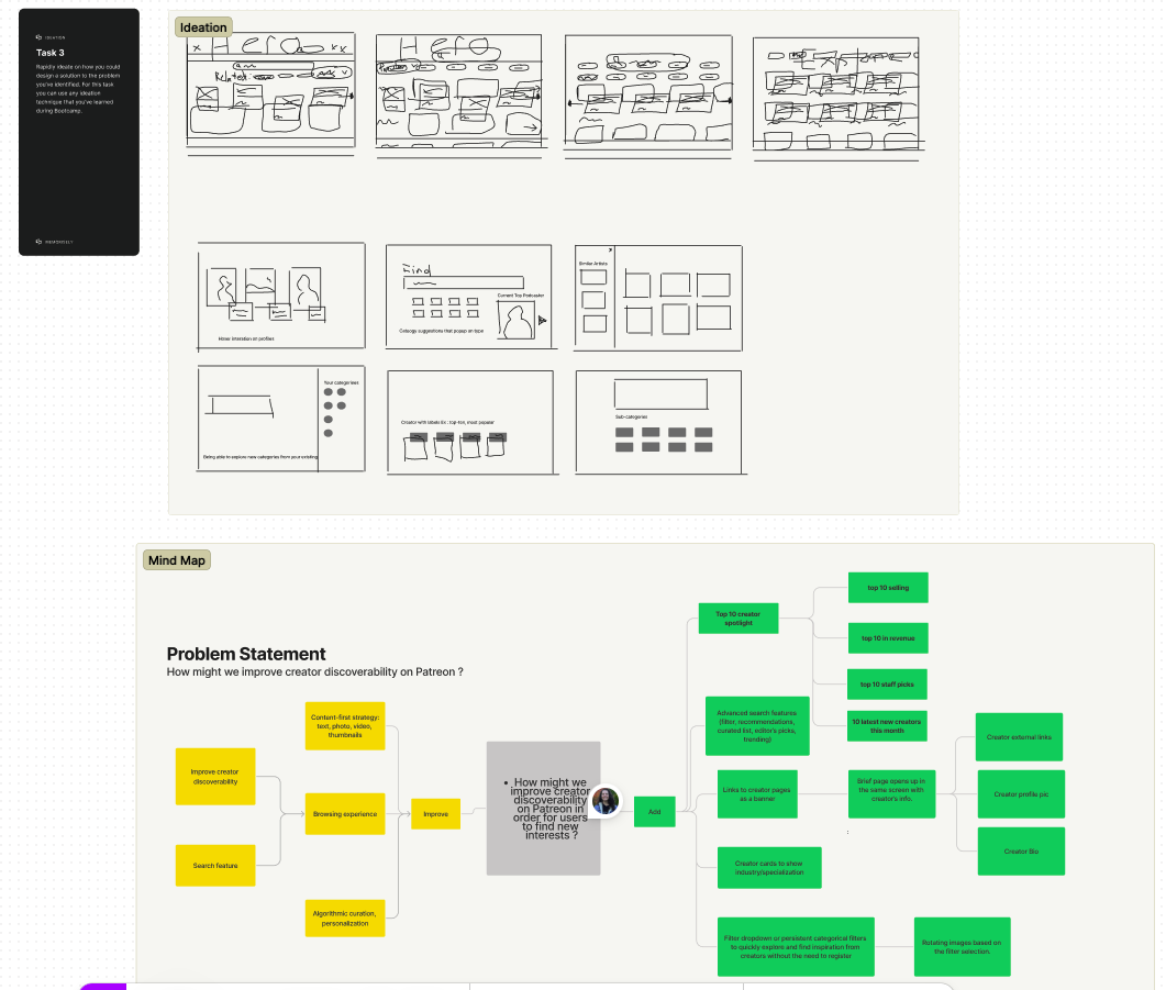
Rapid Ideation & Mind Mapping

We took the time to rough out design solutions with Crazy 8's exercises as well as Mind Mapping. I personally really enjoy the way mind mapping exercises as it allows us to further divide the approach into "improve" aspects and or "add" to the feature at hand, which is great for prioritizing as well as guiding the wifreframes further.

user_flow_graph

Ideas on what we could newly add included:

  • Top 10 creator spotlight
    1. Top 10 selling
    2. Top 10 staff picks
    3. Top 10 new creators this month
  • Advanced search features (filter, recommendations, curated list, editor's picks, trending)
  • Links To creator pages as a banner.
    1. Brief page opens up in the same screen with creator's info (social links, profile pic, creator bio)
  • Creator cards in order to show industry specialization.
  • Filter dropdown or persistent categorical filters to quickly explore and find inspiration from creators without the need to register.
    1. Rotating images based on the filter selection

User Flows

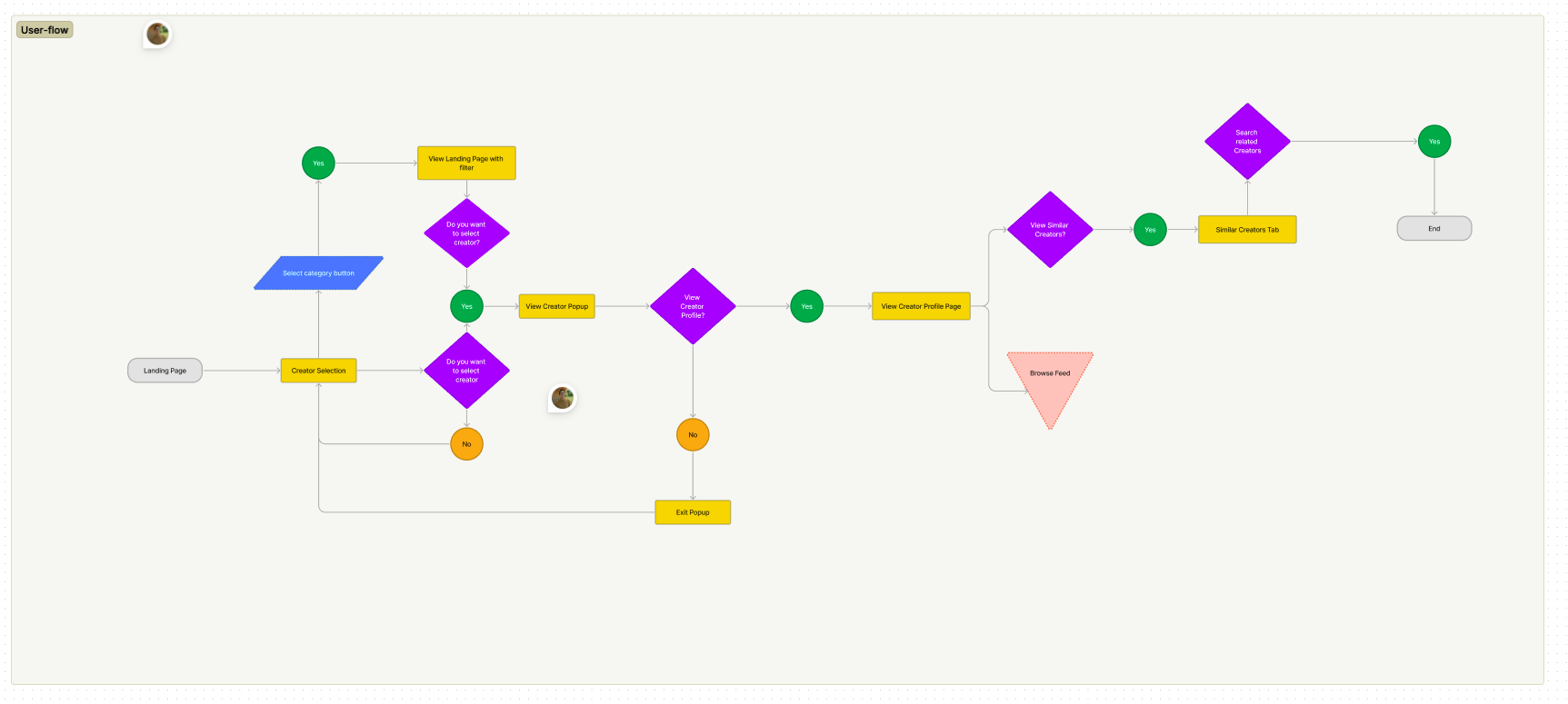
We decided to enhance the current landing page's discover feature. This area seemed very interesting as we found it had a lot of potential to make it more interactive and engaging to users.

existing_user_flow_graph
  1. Select category button
    • This allows to view the creators with a category filter
  2. Do you want to select a creator ?
    • Views the creator pop-up
    • Image gallery and short bio
    • Includes links
  3. View Creator Profile
    • View similar creators

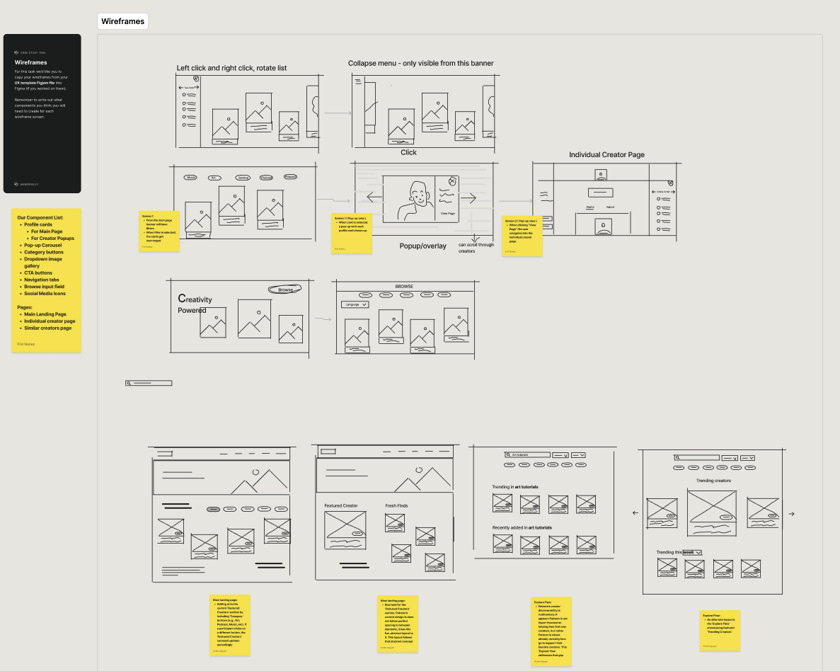
Lo-fidelity wireframes

The process to create the wireframes included making use of exisitng button shapes, categories, icons and user profiles. Layouts and grid of thumbnails helped as well as making sure we included notes of "to do's" and list out components we would need for future iterations on the Hi-fi version.

wireframes

Design

Style Guides

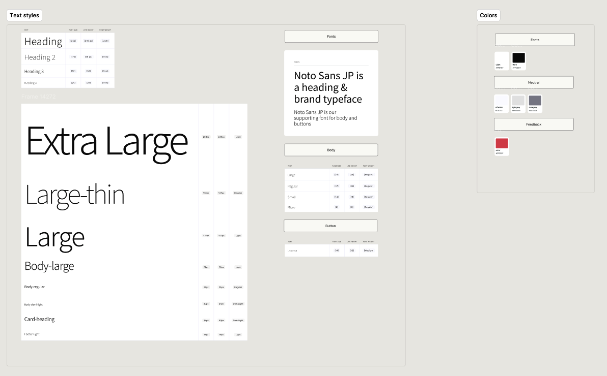
Ensuring consistency in our design approach is key and with this mind we made sure to create a color and font library in order to begin the design process.

Color & Font Styles

Given Patreon's simplistic and limited approach to their visual design. Establishing the visual components, icons, colors and fonts to align with the brand's identity was a smooth process in this case-study.

color_styles

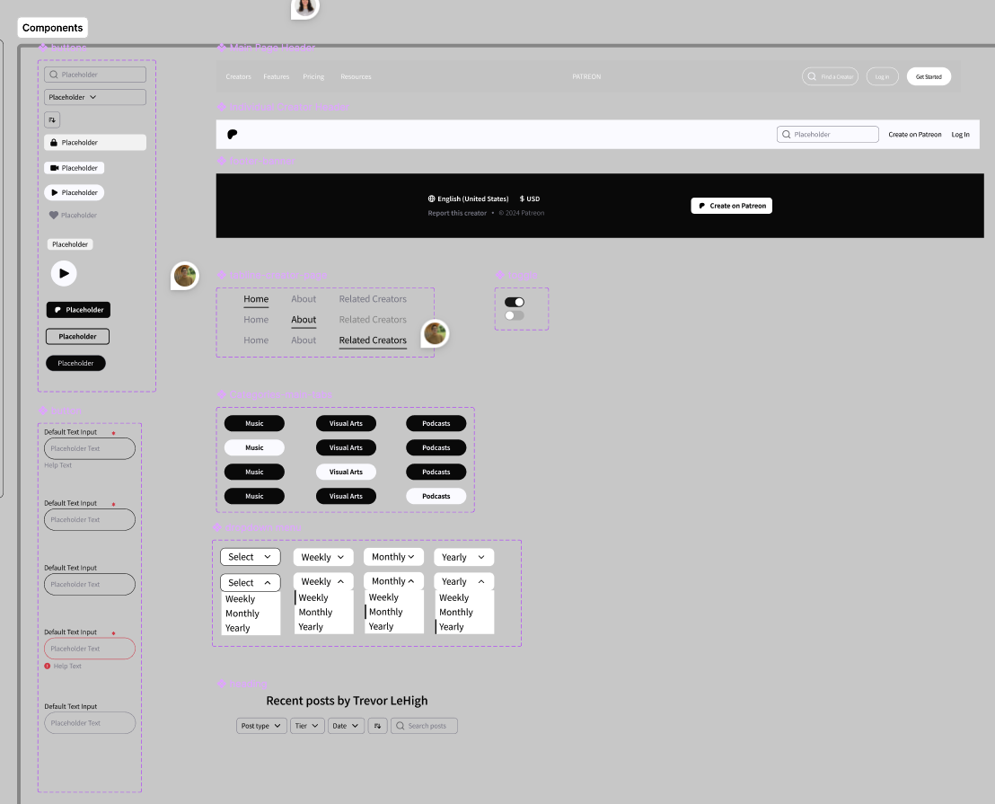
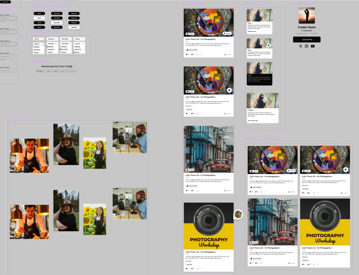
UI Components

Some challenges/learning experiences faced during the component creation phase was, the various prototypes we wanted to have and the complexity with layers in ensuring they connected well when playing the flow in Figma. Among those where the following interactions we solved:

  • A moving horizontal gallery with filter buttons synced
  • A user profile pop-up component with an overlay and integrated photo gallery
  • A dropdown with the ability to filter through image sections

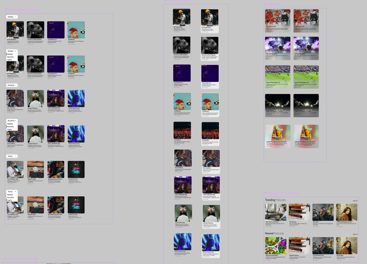
Below are some screenshots of our design components:

text_styles text_styles text_styles

High-Fidelity Prototype

The feature for the Patreon app culminated in a user-centric solution that effectively addresses key challenges. By thoroughly understanding user needs and pain points, we developed intuitive navigation, recommendations, and improved content categorization from within the landing page to the individual creator's page.

Included in our design flow are the following:

  • New tabs to filter by categories within the creator gallery section
  • A user profile pop-up component with more info on the selected creator
  • Two linkwithin this pop-up, one for the creator's page and another for Similar Creators page
  • An integrated gallery navigation within this pop-up with additional pictures about the artist
  • A "Similar Creators" page/section within the individial creator's page
  • Two discovery gallerieswithin this new page, one for similar creators and another "trending" creators gallery that allows to filter by "weekly", "monthly" or "yearly"

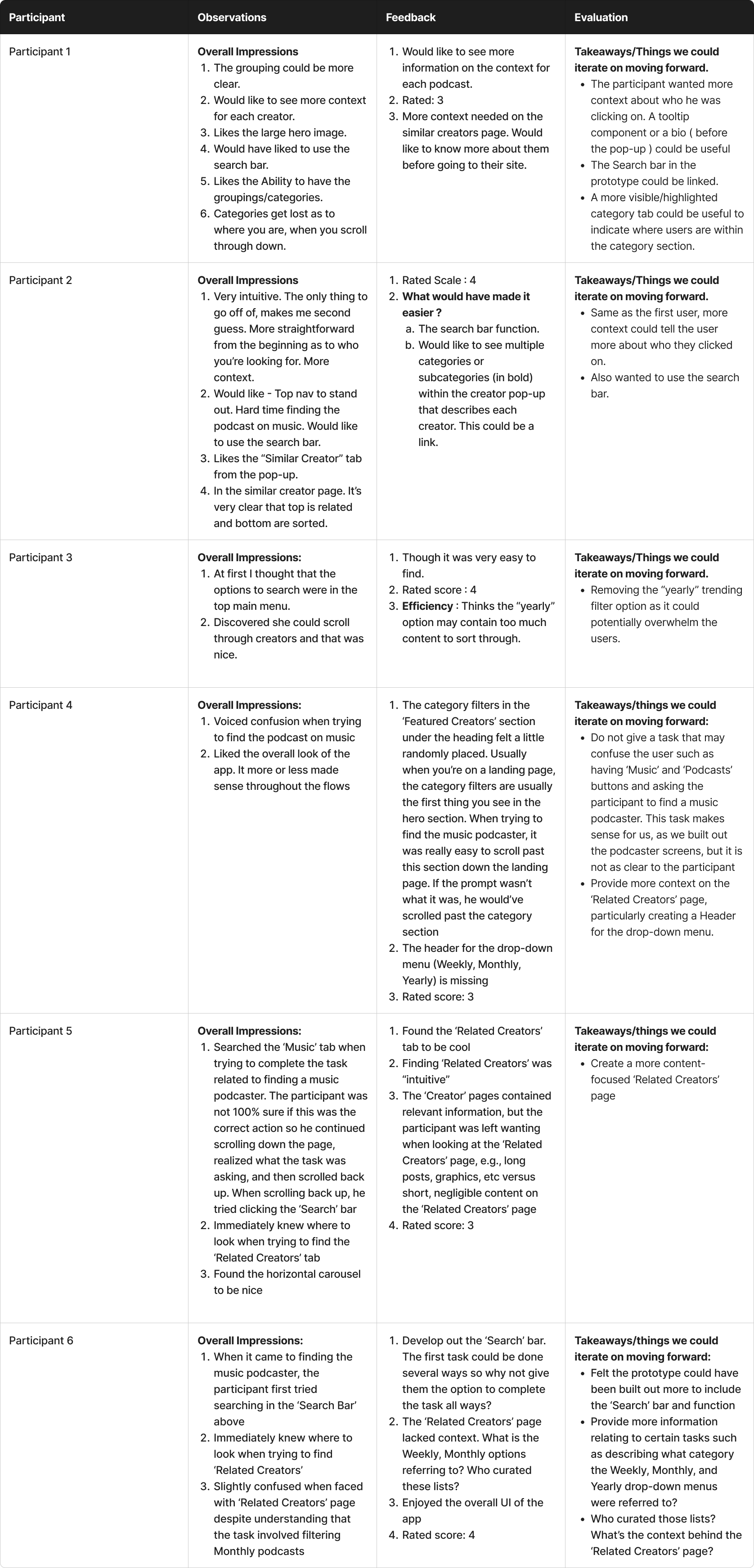
Usability Test

A big learning of course is the usability testing portion. When conducting user interviews for the usability part we learned more about what iterations we could be implemented while moving forward. This would also lead to improvements by creating user experiements via A/B Testing.

usability_report

Reflection

Through extensive user research and iterative design, we implemented intuitive navigation, enhanced search capabilities, and recommendations. These improvements facilitate easier discovery of new and niche creators, increasing patron engagement and support. The final design effectively meets the needs of both creators and patrons, promoting higher satisfaction and contributing to the overall growth and success of the Patreon platform.

I was incredibly proud I got the opportunity to work on this case study. It was a rewarding experience that allowed me to dive into unique challenges that both creators and followers may face. Working on it felt like a meaningful cause as it aligned with my passion for creating user-centered designs.