AirBnB Case Study

Intro

As part of the Memorisely 2024's UX/UI Design cohort, our first case-study to solve revolved around building an non-existent feature for the AirBnb travel app. Specifically at the time, AirBnb had no way to split group payments across their iOS mobile app when using it for bookings. This lead to inconvenience as well as having to use third party payment apps amongst groups.

Timeline : 10 weeks

Business Goal

The business goal was defined as : "Our goal is to enhance the user experience of booking accommodation as a group. Currently, only individuals can book accommodation and encourage their friends or colleagues to pay them back after payment is made. We'd like to make it easier for groups of people to split the cost of an Airbnb when traveling together"
Final Version

Design Brief

User Segment

The user segment we'd like to target to improve the group booking experience on Airbnb.com consists of travelers who plan trips together in larger parties, such as families, friends, and co-workers.

These users typically require accommodations that can comfortably accommodate multiple guests and offer amenities suited for group travel, such as shared living spaces, multiple bedrooms, and family-friendly facilities. They often seek longer stays and may be interested in exploring discounts or special offers for larger parties.

By catering to the specific needs of this segment, we aim to enhance their booking journey, increase user satisfaction, and tap into a relatively untapped market to drive higher revenue and gain a competitive advantage.

Problem Statement

By understanding the business need we defined our problem statement as : Traveling professionals need an enhanced cost-splitting feature and improved communication because they desire a more user-friendly and integrated experience. However, the current experience involves challenges in cost-splitting, communication and inclusiveness during the booking process leading to user frustration and inconvenience

Solution

This was a great example of a real world opportunity that allowed me to build a solution for an existing experience with abundant user traffic. Things that came to mind upon initial brainstorming sessions where : user profile tagging, customizable payment splits, group chats and payment tracking and reminders. Based on the Qualitative research data we gathered from our survey results. We decided to implement a solution that was based directly on a user pain points. As a formal plan in order to implement the design, the process became the following:

  • Discovery

    1. Qualitative Research
    2. Synthesis and Affinity Mapping
    3. Benchmarking & Competitor Analysis
    4. IA (Information Architecture)
  • Ideation

    1. Mind Map
    2. Cray 8's sketches
    3. User Flow
  • Design

    1. Lo-fidelity wireframes
    2. Color & Text Styles
    3. UI Components
    4. Hi-Fidelity Prototyping
    5. Usability Testing

Discovery

Qualitative Research

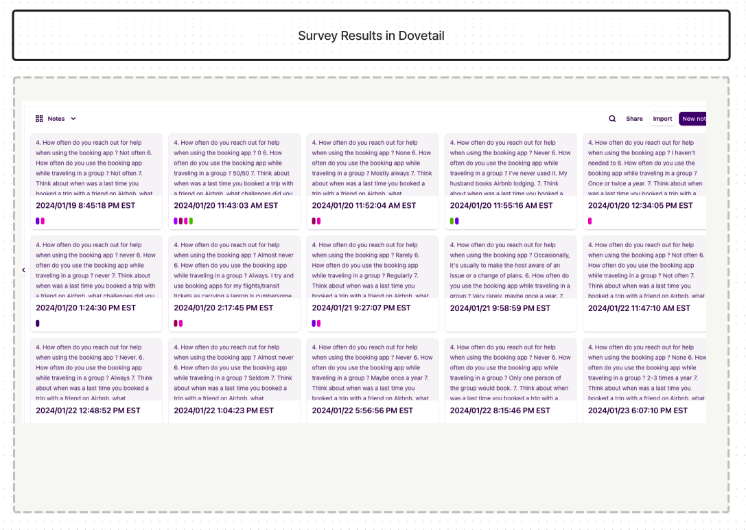
In order to get a good understanding of user pain points and needs, we started off with Qualitative user interviews which was created via Google forms and sent to 14 experienced travelers. We asked questions surrounding their general frustrations as well as preferred payment splitting methods.

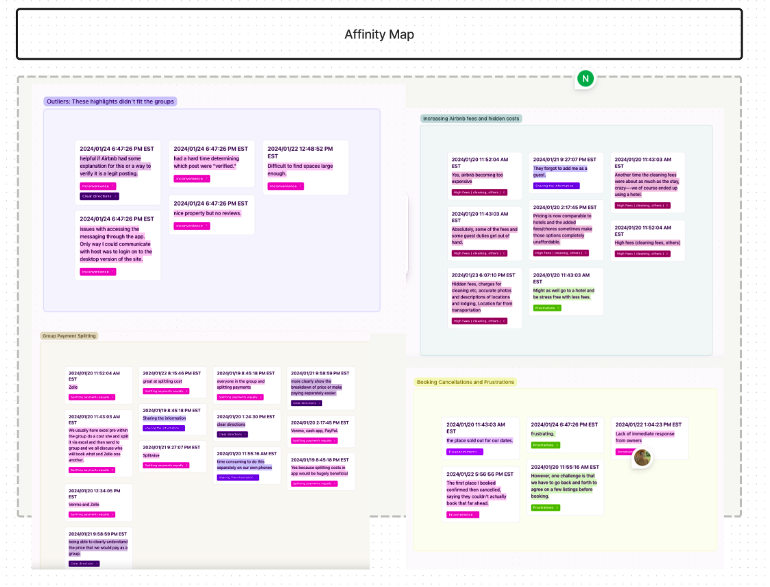
Following this, we made sure to synthesize these results via Dovetail. This allowed us to organize it and advance our design approach by creating an Affinity Map.

Synthesis and Affinity Mapping

Highlights from affinity mapping based on user feedback :

  • Users wanted a clearer breakdown of prices and payment
  • Users wished the cost splitting ability was built-in
  • Users wanted clear directions
  • Users said it was time consuming to switch between apps
  • Users wanted to clearly understand the price as a group

Ideation

User Flows

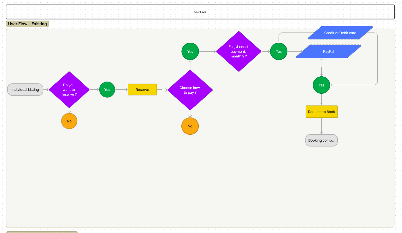
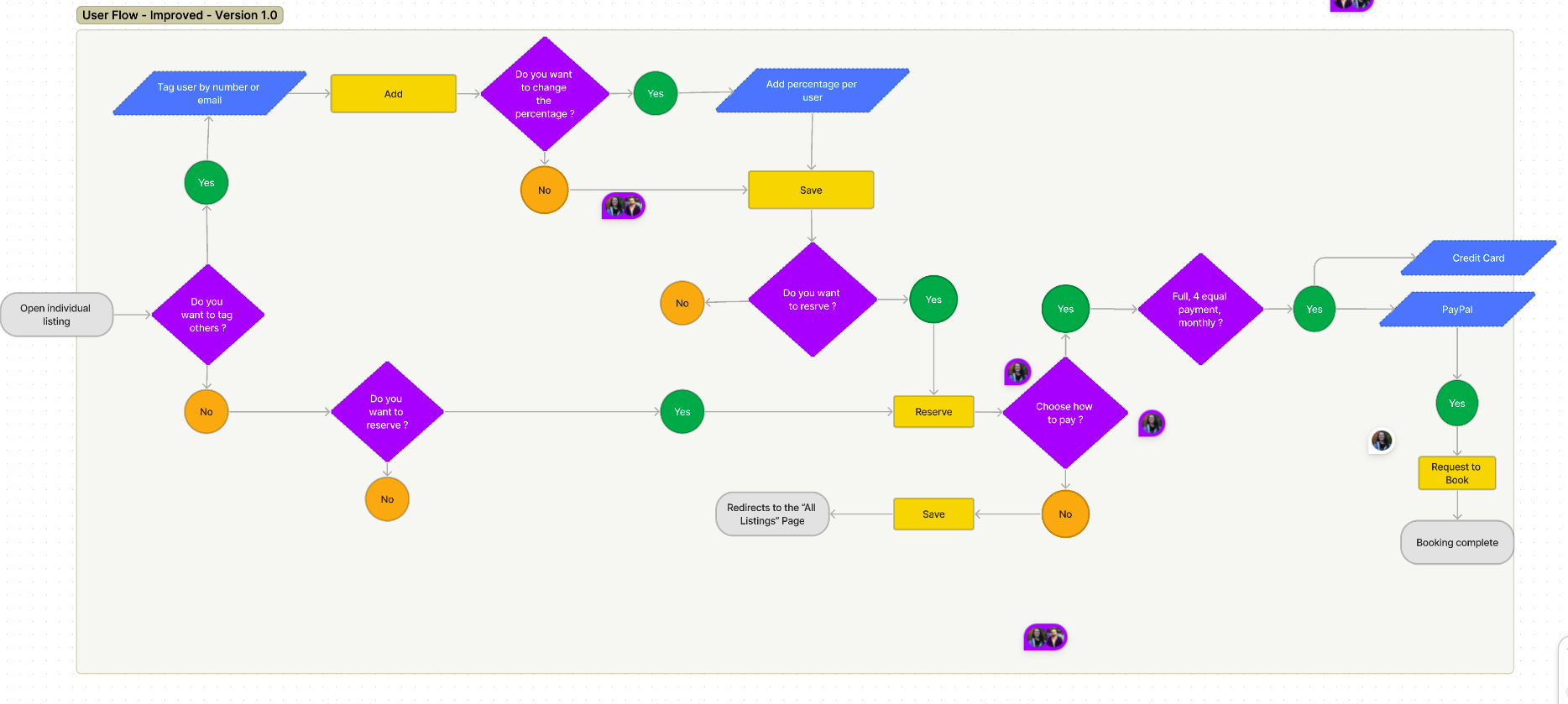
While mapping out the existing content of AirBnb, we realized we had to alter the structure to include another path users could take. The best place to add this was within the individual listing page. Here the users have the option to add other users before being prompted to make their payment or continue as usual to the bookings page.

existing_user_flow_graph improved_user_flow_graph

Lo-fidelity wireframes

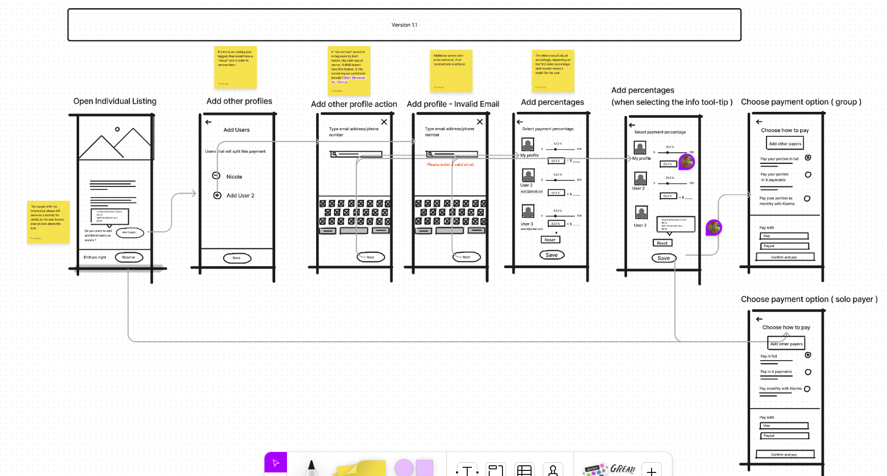
Starting the wireframes allowed us to really start outlining the placement of key elements such as buttons, menus, content areas, and interactive parts without getting bogged down in visual design details. This was the phase that showed us how our feature was going to become a reality. By focusing on the skeletal framework of the interface, wireframes help us in the following :

  • Guide the visual design
  • Clarify concepts early on
  • Create quick iterations
  • Identify potential issues
  • Allow for collaboration
wireframes

Design

Style Guides

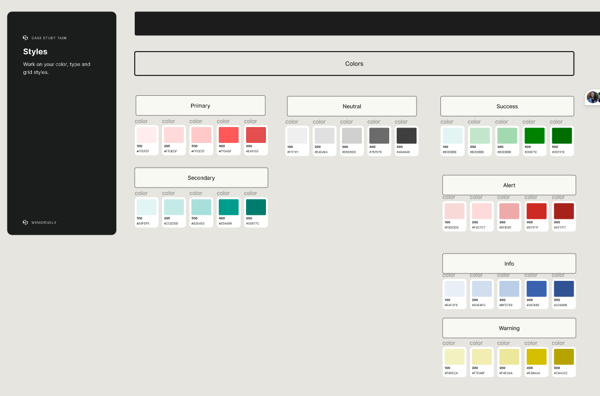
By understanding the brand's defined visual identity, including colors, typography, and any other design elements that reflect AirBnB's personality; the next task was to create a color and font style library in order to reuse them for consistency when building out the design.

Color Styles

As best practice we included a our primary, secondary, neutral as well as feedback HEX color values in our swatches.

color_styles

Font Styles

By continuing to inspect the app, we defined the font styles. This included font-family, font-sizes, font-weights. All categorized within heaging, body and button styles.

text_styles

UI Components

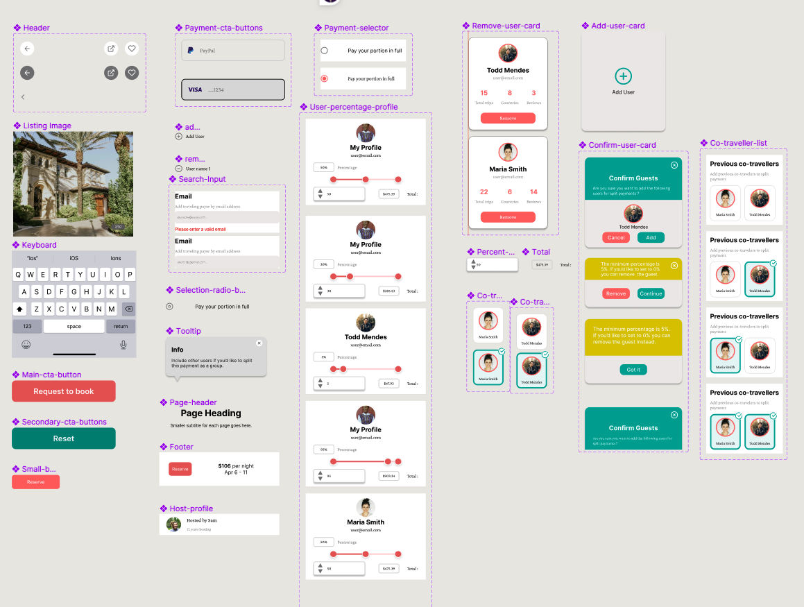
By creating reusable UI components in Figma such as buttons, icons, and navigation bars, we maintained visual coherence, streamlined updates, and accelerated the development. This ensures a cohesive and user-friendly experience while saving time.

Understanding auto-layout and component variants in Figma is crucial for efficient and consistency. Auto-layout enables dynamic resizing and alignment of UI elements, ensuring adaptability across different screen sizes and content lengths.

Component variants allow for the creation of reusable elements with multiple states/variations which facilitates quick iteration. Usage of these features streamlines the design process and promotes scalability.

text_styles

UI Iterations

UI iterations allow us to refine and improve the UI based on feedback and testing. By iterating on ideas, we addressed and identified usability issues around the behavior of the slider component.

We originally had it go from point A to point B seamlessly. However, we came to understand that users would need to stop at a certain percentage and thus this change was made to accommodate for this. We included several variants as a part of this component to allow the user to do just that. This was the first version which was later changed.

Initial Version
Component Experimentation

High-Fidelity Prototype

The High-Fidelity Prototype is one of the more exciting parts of the overall design process. It provided a realistic representation of the final product, allowing us to visualize and interact with the design as if it were developed. This enables thorough testing, validation of design decisions, and effective communication of the user experience, leading to more informed iterations and ultimately, a better final product. Below are highlights of the flow we introduced in the hi-fi prototype:

  • Ability to add new guests by email
  • Ability to previous co-traveler from a list
  • Ability to split the cost evenly or as a custom amount
  • Ability to pay your portion in full or separate payments
Final Version

Usability Test

Takeaway:
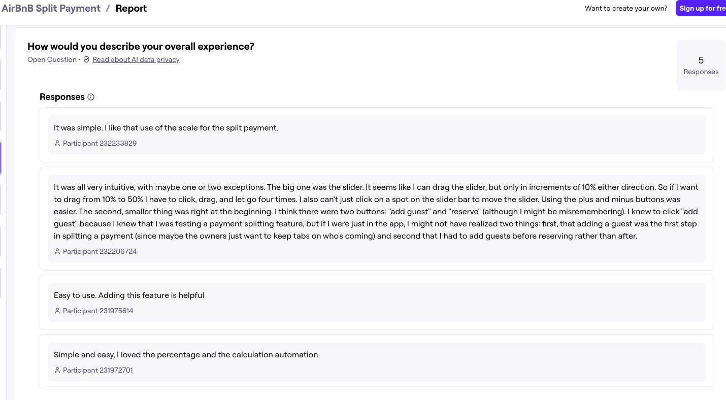
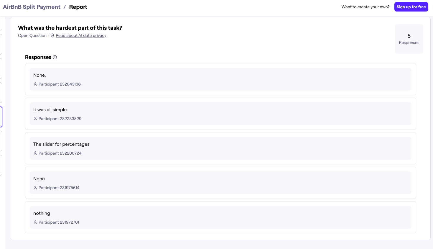
Some responses from the Usability report reiterated my understanding of the best cases to document for developer-handoff. Below are some of the user feedback from the usability tests we sent.

usability_report usability_report
  1. Based on my initial understanding of Figma's limitation when working with sliders, the smoothness of the scroll can only be present if it is built in such a way where the user wouldn't need to stop at a certain percentage. This was a great example of a developer handoff note allowing them to keep in mind the prototype's difference from the real world use-case and how the participant identified this.
  2. “Do other guests have control over the percentage split ?” This was a great insight from a participant. Ideally a future iteration of this would be to add a success screen/waiting screen letting the user know, of the other guests approval for the split before being able to finalize their payment.

Developer Handoff

For the implementation phase, we understood the need to document the design assets. Making sure to include detailed specifications and annotated wireframes, as well as pixel-perfect mockups along with updated CSS. Below are some highlighted notes that we would ensure to communicate to the developers:

  • Payment Splitting Logic: We determined that the total cost is by default divided evenly amongst travelers within a group. This default amount would change depending on how many people are included.
  • UI Components: Specifications for our UI components include, smooth scroll animation for the slider, reset button which sets back the percentages to an even amount and user profile components with outlined CSS
  • Error Handling and Validation: Some of the things that came to mind with error states include, outlining validation rules for scenarios like insufficient funds, incomplete payment information, or attempts to split costs unevenly without consensus. Further, as designers we understood how defining these errors should be communicated to users via the dev phase.

Reflection

This project highlighted the significance of collaboration and communication within a design team, as well as the importance of receiving and incorporating constructive feedback. Building the feature reinforced the importance of attention to detail in UI design, such as typography, color schemes, and iconography, to create a visually appealing and cohesive UI while keeping in mind the brand identity.

Overall, this case-study provided me with hands-on experience in the entire design process, from ideation to execution, and highlighted the importance of empathy, iteration, and collaboration.